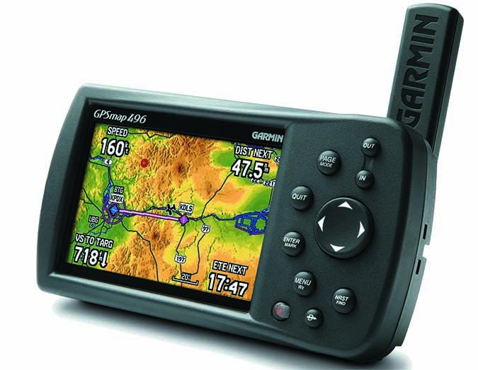
Everything Old is New

Hang around any industry long enough and you’ll enjoy the deja vu of yesterday’s news repackaged as today’s cutting edge. Sometimes that’s avocado green as a stylish color, but other times it marks technology enabling something that was only half successful before.

You could argue this is exactly what’s going on with ForeFlight 8 and its new maps system. Wasn’t this what AnywhereMap and the Garmin 396 did? Isn’t this what WingX originally did and still offers? In fact, didn’t sectional and en route charts appear in our tablet apps because users demanded facsimiles of the paper charts?

I remember an AirVenture roughly six years ago, sitting across a bean burrito from one of the app developers listed above as he shook his head, saying he begrudgingly added sectionals to the app. His point was simple: The data-driven map was faster and more versatile, and pilots wanted charts only because they were used to charts, not because they were better.

I countered then the same thing I’ll say now: Our aeronautical charts evolved into an effective tool over decades of use. They are a marvel of information density matched with usability. Information density is not the same as information overload. (If you’re interested in this topic, I recommend the work of Edward Tufte.)

Sure, there are facets akin to QWERTY keyboard layout (it’s not the most efficient layout for typing, but it’s what everyone is already used to). Why are all the variations in airspace drawn in only magenta and blue? Now that we’re always looking at backlit screens without red cockpit lighting, shouldn’t prohibited areas be in red? Well, they could be, but they’ve always been in blue, so…

However, interacting at once with all layers of information while using a traditional chart exposes us to incidental data we’d never know existed. “Wow, there are some tall towers west of the field.” “Look, a VFR reporting point near my destination airport. That could be handy.” “Hey, there’s a major highway paralleling my route if I fly just 15 miles further north.” That information can save our bacon, or at least keep it from getting too crispy..

This came up in during my first ForeFlight 8 demo. By chance, the map scrolled past an area I fly quite a bit and I noticed an alert area and two restricted airspaces were missing. It turned out airspaces had been turned off. With a tap, they reappeared, but the very fact that they could be turned off underscored an issue with dynamic data. It’s more rope. That makes it a useful tool, and a potential noose.

When the airspaces popped back up, the restricted areas were painted orange, not the traditional blue. This was intentional. Orange is more logical; it’s a warning color. However, generations of pilots know blue could be restricted airspace and it gets their attention accordingly. It’s the QWERTY keyboard problem again.

Then again, maybe not everyone. Three different designated pilot examiners have told me new private pilot applicants often treat the sectional chart displayed on their iPad like aviation-themed wallpaper. They’ve asked pilot applicants for the CTAF frequency for an airport on the chart and watched the pilot tap the airport symbol and retrieve the frequency from the pop-up window—even though the same information was literally at their fingertip before they tapped.

While ForeFlight doesn’t release how many users they have, it’s likely a sizable majority of active pilots, so we’ll see a reaction across a wide range of users. I expect the ForeFlight fanatics will adore it. The company enjoys an Apple-esque, do-no-wrong status to some degree. However, if history repeats itself the bulk of users will play with it for a bit—and then go back to their sectionals. Some may go belt-and-suspenders painting the new aero data over the sectional chart.

At least for a while. ForeFlight might have the critical mass to topple our community fondness for pixel representations of old paper charts. In the end, I think that’s a good thing, even a necessary thing.

So I’ll place my bet right now: Future ForeFlight releases of ForeFlight’s dynamic map will bring back sectional-like incidental data. It will fill back in with a density of information but in a downplayed style that’s ready to come to the fore (sorry, couldn’t resist) with a tap as it catches your eye. Actually, I expect the electronics will meet us halfway, proactively offering information we likely need, such as highlighting VFR reporting points when approaching an airport without an instrument procedure loaded.

It’s possible this round of mapping technology—and the people wielding it – will deliver both the promise of dynamism and the value of dense information design. Let’s just hope avocado green color schemes stay off the table.