ForeFlight 8: New Maps, Logbook, Web Planning

The tablet app used by a majority of pilots gets a new mapping system, but we think its more potential than practical for now.

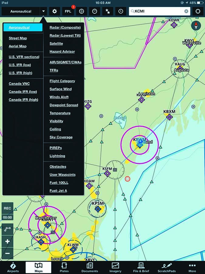
One of the major announcements from AirVenture 2016 was ForeFlight’s version 8. At least it was major in the eyes of the company. ForeFlight CEO Tyson Weihs told us it “might be our biggest release since 2011.”

That year marked ForeFlight’s first release designed specifically for the iPad, which one could argue changed GA cockpit information forever.

ForeFlight 8 didn’t actually release until late August, but we’ve logged time with a preview version since this summer and only half agree with Weihs. The new version lays the groundwork for huge changes. However, we doubt the day-to-day use of the app will change for most pilots. Not yet anyway. Check out the sidebar on page 19 for more on that.

For what’s actually new in the app, read on.

Maps Go Dynamic

The most obvious change is in mapping. Pilots using ForeFlight spend the majority of their time with a sectional or IFR en route chart as the background, over which they see their aircraft, route, weather and more. ForeFlight has long offered a simple “World Map,” showing only state boundaries beneath the overlays of weather or TFRs.

Foreflight 8 aeronautical layer

old foreflight app

ForeFlight 8 replaces the World Map with a new “Aeronautical” layer. This includes airports, airspace, airways, waypoints, VORs and other critical flight data normally found on a sectional. This data scales and changes dynamically as you pan and zoom the chart, decluttering information as you zoom out and adding information as you zoom in. Labels move as needed for readability. If you zoom in far enough on an airport, you get the airport diagram. Zoom in further and taxiway labels appear.

The effect is similar to the moving map on most MFDs or dedicated aviation portable, the most notable difference being smoothness. In ForeFlight, it’s a seamless experience at any zoom level. Dynamic mapping works in any orientation, whereas the text on sectionals is only upright when the map is drawn north-up.

Tapping on a symbol on the Aeronautical layer brings up detailed information just as before, as well as some new features. Tap a dynamically drawn airway and you’ll see the MEA and MOCA for that airway segment.

The new dynamically drawn maps also offer day and night themes for ease of viewing under different conditions, as well as customization. You can add terrain shading under the aero data, turn off private airports or airspace lines or increase the size of labels for presbyopic eyes. Customization means you can turn off information you wish you hadn’t—such as airspace—so use caution when tweaking the chart.

One of the new features is a TFR warning system similar to the runway warnings ForeFlight has offered for some time. If you’ve downloaded TFRs for your flight area, or have ForeFlight connected to ADS-B data, you’ll get a warning of approaching a TFR, or—gulp—being inside of one. More importantly, you’ll get it whether or not you have the TFR layer visible on the map.

You’ll want to ensure ForeFlight’s audio output is routed to your audio panel or headset via cable or Bluetooth for full advantage with this feature. The FAA reports show a marked decrease in TFR violations concurrent with these areas being mapped on EFBs like ForeFlight.

ForeFlight believes the Aero layer will replace the sectional or en route charts for most users most of the time. However, if a user needs something from the full chart, he can turn that layer back on. This draws both the sectional (or en route chart) and the aeronautical info. Users can also turn off the aero layer and just use the traditional chart—and all of ForeFlight—just as before.

Our opinion is many pilots will do just that (see sidebar on page 19). The aeronautical layer has the critical items most pilots will need for most flights, but it’s far from comprehensive. Weihs says that, while the company will still include traditional chart backgrounds for the foreseeable future, the data-driven approach to aviation information is a far more productive experience. For example, the company has been working with the FAA on how data is updated and disseminated.

Weihs envisions a day soon where “an airport manager could make a runway closed and 10 minutes later pilots worldwide could see it marked as closed on their iPads.” You have to admit, that would be cool.

Logbook, Online Planning Get Boosts

ForeFlight’s previous version offered a simple logbook, but the fact that over a third of ForeFlight users started using the logbook made improving the system a priority for the company. The most notable addition is with sharing of flights. Now you can create a logbook entry, or approve one ForeFlight generates automatically, and send it to another ForeFlight user.

foreflight 8

foreflight 8

This makes sense with two crewmembers or with flight instruction. ForeFlight also added remote signing for instructors. So combining the two, a student entry could be created, shared with the instructor for signing and approved such that matching entries appeared in both digital logbooks.

There’s also a new logbook API for third parties to access the ForeFlight logbook and generate flights or request data. This might be useful if you’re practicing on an approved simulator and want those flights recorded automatically (and correctly) in your logbook.

The overhaul of ForeFlight Web is more significant. ForeFlight’s stated goal is matching the online experience with the iPad one, so you could comfortably plan and file from your desktop and simply load the flight plan already synced to your iPad. As part of this, ForeFlight 8 allows planning and filing throughout North America, including intra-Canada VFR and the Caribbean.

foreflight 8 alerts

Our experience with the online version is that it’s acceptable if you happen to be sitting at your desk, but we think the iPad system is still superior. All the important features are available online—selecting specific aircraft, on-screen editing, procedure advisor—but ForeFlight was designed for the iPad and that’s where it shines. The sync works both ways, however, so you can also plan on the iPad and then check up on weather or review a chart when you take a break from that sales spreadsheet you’re obsessing over.

What we do like better in the web browser than on the iPad are generating 8710 or flight experience reports and reviewing track logs from previous flights. You can also share flights from here, or download a KML file to view in Google Earth or on a debriefing tool such as the CloudAhoy.

Is it a Better EFB?

foreflight 8 aeronautical layer

foreflight 8 aeronautical layer

If you’re already a ForeFlight user, the advent of ForeFlight 8 isn’t so much an option as a natural evolution. The good news for those recalcitrant to change is you can set the new ForeFlight to look and feel virtually identical to the old one. The other reassuring tidbit is performance of the app seems unchanged for many and improved for others. We happen to own one of the worst iPad versions for ForeFlight performance and saw virtually no difference between version 8 and the latest version 7.

If you’re not a ForeFlight user, is this change enough to switch? We think not. Users preferring WingX, Garmin Pilot or another option are unlikely to find ForeFlight’s new offering irresistible given the learning curve of a new app and ForeFlight’s more premium pricing.

What’s more important is the potential of dynamic data for an EFB. Simply correcting information in the app rather than issuing NOTAMs and textual chart updates simply makes sense. Taking it further, a dynamic instrument approach chart could remove or de-emphasize approach categories that don’t apply or transitions the pilot isn’t flying, greatly simplifying the chart. There’s real potential there.

We’re heartened that ForeFlight is working directly with the FAA and industry partners (and even competitors through working groups) to create new standards and better data distribution because these fundamental use changes work best when we all settle down on some similar standards. For example, Garmin gave us the PROC button on a GPS navigator, but now everyone uses that label. The best user interface often comes directly from the real-world experience of users. That may be the biggest long-term effect of the thinking behind ForeFlight 8: helping with the information management that’s a core part of flying today. ForeFlight is leading the way right now. We expect the industry will follow.

ForeFlight 8 requires a fresh subscription. Customers with existing subscriptions will receive a prorated credit. Visit www.ForeFlight.com.