by Jeff Van West
Weve been hearing about-and writing about-the paperless cockpit for most of the last half decade and although the idea resonates, its frustratingly unrealized. Unless you happen to own or plan to buy an airplane from Columbia Aircraft, which, at long last, has tamed the beast and made the flight library a more workable if not a perfect concept.
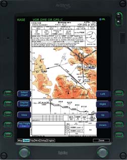
Back in our August 2005 issue, we reported on our test flight of two solutions for viewing Jepp charts on an MFD (Electronic Flight Library: Nice Idea, Needs Work, August 2005, Aviation Consumer.) Our biggest quibble with the system was that neither the Garmin MX20 in our Mooney nor the Avidyne Entegra in the Cirrus SR22 we flew could display the whole chart at once – at least not at a resolution readable by the average pilots eyes.
The problem with not seeing the entire chart at once is two-fold. First, you have to scroll through a series of pages to view the data you need at that moment. When you suddenly doubt your memory that the MDA is 520 feet instead of 620 feet while on final descent, the last thing you want to do is scroll through a bunch of pages.
Second, years of practice makes finding a key piece of data within the context of the entire chart a snap. Even though the close-up slices of minima numbers or the profile view are exact representations of a standard Jepp chart, understanding the information out of context takes an extra moment or two. Its not that it cant be done, but its harder than glancing down at paper. If the new technology makes us work harder, then we don’t want to be bothered.
Rotate 90
The solution? Rotate the Avidyne Entegra displays into the portrait orientation, as is done for the E-Chart system on the Columbia 400 we recently flew, and you can read the entire chart at once. This makes a huge difference. After you call up the appropriate chart from the database, its there for your briefing without any extra fiddling.
Twist the Entegras mode selector back to Map and you have your MFD again. Twist back to Chart and you can get whatever you need from the chart at a glance. As you fly the approach, a geo-referenced airplane symbol appears on the chart display, giving your exact lateral position on the approach. But, why switch back to map when the airplanes position appears on the plate?There’s a reason for that.
Even though you can see the entire chart on the MFD, thats all you can see. After youve gotten used to working with an MFD on approach, that simply isn’t enough.
The MFD display provides so much more data – terrain, traffic, weather, waypoints and legs – that viewing a lowly approach plate feels like a waste of valuable real estate. It might be different if your vertical position was mapped on the Jepp plate profile view, but it isn’t. Perhaps some day.
Short of Perfect
As we said in our previous report, we think reproducing a paper product on a display is inherently limiting. The Map screen of any MFD was designed to provide layers of information at once. Until someone steps up and creates a new way of displaying just the information the pilot needs, at the right time, and directly on the map display, then digital charts will be little more than fancy paper.
While shooting approaches in the Columbia 400, we flipped to the chart page to brief the approach and then flipped back to the Map view to fly it. If we needed to double-check something on the plate, it was an easy twist to see the whole plate and an easy twist back to the Map when we were done.
The portrait orientation makes the E-charts functionally equivalent to paper, but not definitely better. Plates on your MFD have the advantage of digital updates, less cockpit clutter and ease of reading at night. In fact, there’s a night mode that makes the charts white on black so they don’t trash your night vision.
On the down side, they require juggling data cards to update and may not be available if something breaks. Before you say that total electrical failure is unlikely, remember that a blown backlight on the PFD means your MFD is now displaying flight instruments. Now getting to that chart is a real pain.
So can you leave your plates behind? Up to now, we confidently said, no, you’ll want to use that paper when it comes to real approaches in the crud.Columbias E-Charts changes that only by degree. While wed still feel naked not having some form of paper within arms reach, we can see how a Columbia owner might shoot hundreds of approaches without ever cracking a book.
Still on the horizon is a data-driven solution from Jeppesen which we see as the ultimate iteration of this technology. A data-driven display would abandon the idea of mimicking the look of the paper plate and would simply project the necessary approach data right on either the PFD or the MFD or both.
Presumably, this would allow some customization of the display, assuming the FAA doesnt muck up the certification with unreasonable or arbitrary requirements. Jeppesen says its working on this but offers no promises on when it might be available. With Avidyne contemplating primary flight displays for aftermarket aircraft, we think a better solution to the electronic flight library is overdue. Meanwhile, were making progress here…but perfection is still over the horizon.
-Jeff Van West is a freelance writer in computer and aviation technology and the editor of IFR magazine.